How to Create a Mobile-Friendly Form
Why Mobile Optimization Matters
In today's workflow, your respondents are rarely sitting at a desk. They are filling out your forms in transit, between meetings, or on-site. A form that is difficult to navigate on a smartphone leads to "drop-off"—where users quit before finishing.
Follow these best practices to ensure your FlowyForm looks and performs perfectly on any device.
1. Use the Mobile Preview Toggle
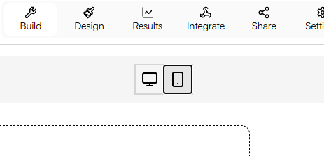
The most important step in mobile design is seeing what your users see. In the FlowyForm builder, you can instantly switch between Desktop and Mobile views.

As you build, click the mobile icon at the top of the canvas. This allows you to check if your images are cropping correctly and if your text remains readable on a narrow screen.
2. Keep Question Text Concise
Mobile screens have limited "real estate." Large blocks of text can push your input fields off the screen, forcing users to scroll excessively.
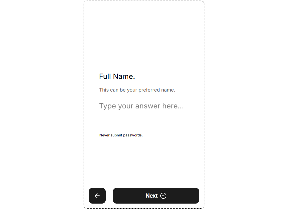
- Short Labels: Instead of "Please enter your full legal name as it appears on your ID," simply use "Full Name."
- Use Descriptions Sparely: Use the optional description field for helpful hints, but keep them under two sentences.

3. Optimize Choice-Based Questions
Questions with many options (like Multiple Choice or Dropdowns) can be challenging on mobile.
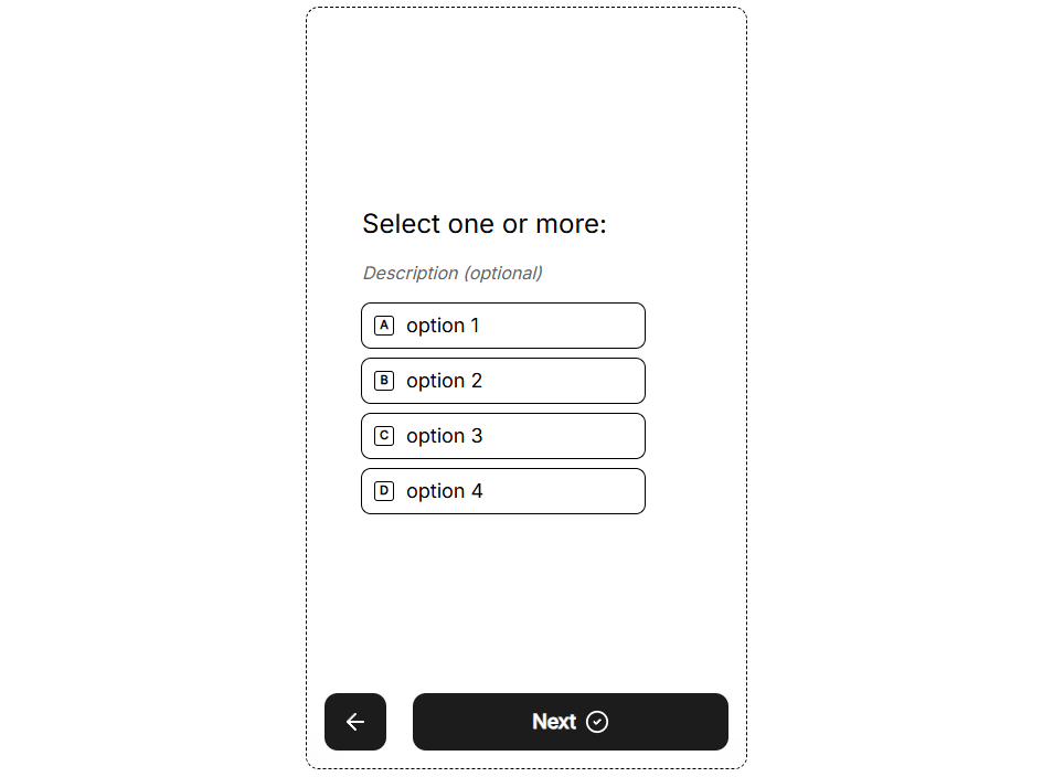
- Limit Choices: Try to keep Multiple Choice options to 5 or fewer. If you have a long list (like a list of countries), use the Dropdown question type to save vertical space.
- Vertical Layouts: FlowyForm automatically stacks choices vertically on mobile to make them "thumb-friendly" targets.

4. Choose High-Contrast Fonts
Mobile users often view forms in high-glare environments (like outdoors). Ensure your font choice is legible:
- Avoid ultra-thin fonts that disappear on small screens.
- Maintain a high contrast between your text color and the background.
- Use a font size that feels comfortable—FlowyForm’s defaults are optimized for mobile readability out of the box.
5. Test Before You Publish
Before sending your form to your audience, perform a "Live Test."
- Click the Preview button in the top right.
- Switch to the mobile frame.
- Interact with every field to ensure the keyboard doesn't block critical information.
Pro-Tip: "Mobile-First" Question Types
When possible, use mobile-optimized fields like the Opinion Scale or Star Rating. These are designed for tapping rather than typing, which significantly speeds up the completion time for mobile users.